

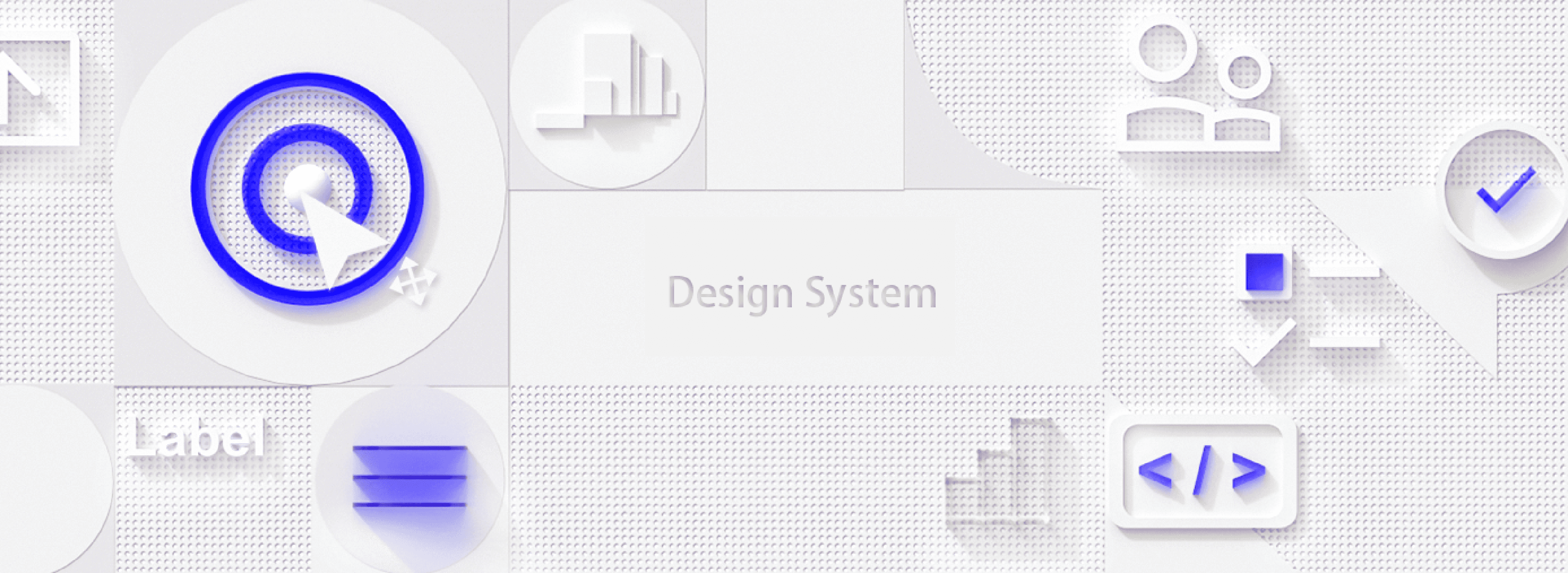
Design System
Research
Styles Design
Flow Design
Component Design
My Role
Enabling designers to quickly access the component library to achieve rapid and consistent page design
3 Designers
A team of developers
Project Scope
Requirement Phase
Design Phase
Development Phase
Scenes
Roles
Outcomes
Painpoints
Goals
Communication - Analysis and evaluation - Project demo
UXUI Design - UXUI Review
Development - Testing
Front-end, back-end, testers
Product managers, marketing and operations staff
UXUI Designer, UXUI Designer
Requirements documentation, wireframe drawings
Flowchart, prototype, visual draft, visual specification document
Component development, page development, product launch
Quickly create demonstrable demos by using component modules in the design system. demos;
Produce system-level design specifications, unified visual specifications and UXUI rules;
A complete design system for designers and new members to quickly understand and master;
The front-end components and description are displayed in the design system for the developers to use;
Long time for demos;
long time for downstream design and development;
No proper management system for requirements, no unification of specifications;
Inconsistent rules of UX and UI specifications;
Repetitive design efforts are waste of resources;
Uniformity caused by update iteration.
No uniform development rules;
Inconsistent component styles resulting in re-modification;
Communication with designers takes up a lot of time affecting the implementation of project;
Building Process
System Structure
Research
Principal
According to the design goal, some pages have been made, select the most suitable as the system component of the target page, and extract the corresponding components of the component library to build and improve the basic components.
In the process of building the basic component library, we refer to some design systems on the market, such as Material Design, IBM Carbon Design, Ant Design, Semi Design, etc. We then summarizeszz the basic functional architecture of the output design system combined with my own business requirements.
To understand the different roles' use cases and requirements for the design system, we engaged with 3 product managers, 3 designers, and 3 developers to learn about their experiences with using the design system, which led to the following table.
At the outset of developing a design system, we actually integrated components into the system while working on projects. However, encountering various component creation scenarios led to some confusion. Consequently, we devised the following process to standardize the addition and utilization of components.
Design System
Value
Global Styles
Navigation
Data Entry
Data Display
Feedback
Copywriting
Colors
Layout
Font
Icons
Shadow
Top Navigation
Side Navigation
Breadcrumb
Pagination
Drowdown
Anchor
Back to top
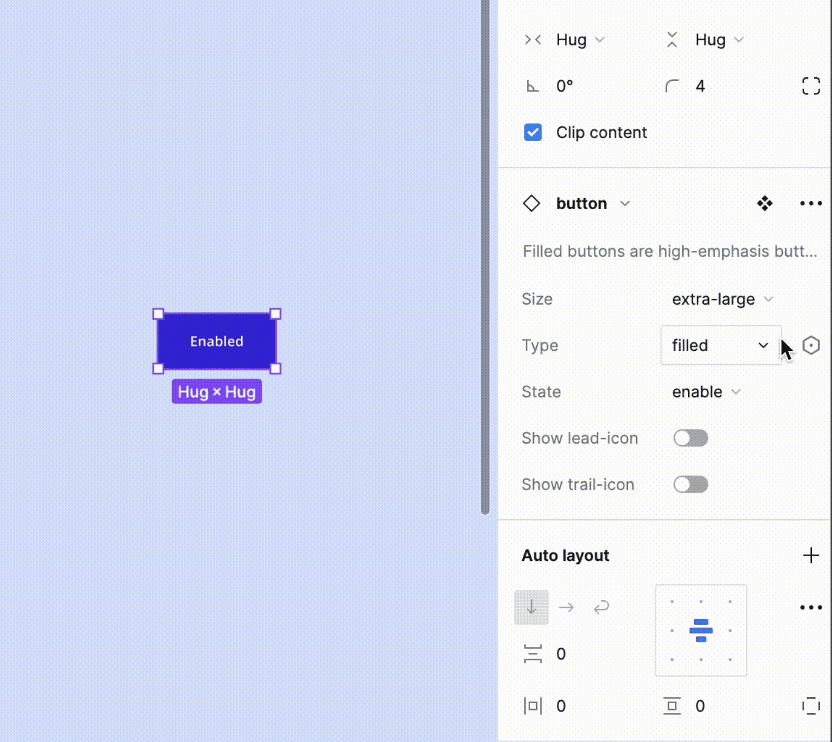
Button
Number picker
Switch
Cascader
Timepicker
Search
Rate
People Picker
Upload
Input
Radio
Checkbox
Timeline
Badge
Lable
Collapse
Popover
Slider
Avatar
Alert
Progress
Modal
Notification
Nature
Nature means more concise component design, users can feel that there are no redundant components, the overall is very smooth.
Efficiency
Pre-configuring features and information can reduce operational costs for users and make websites run quickly.
Inclusion
Inclusiveness is reflected in two main aspects: the design should adapt to different businesses, while meeting the needs of a wider range of people.
Data Entry
Button
Disabled
Primary button
Focused
Primary button
Hover
Primary button
Idle
Primary button
Regular
Disabled
Primary button
Focused
Primary button
Hover
Primary button
Idle
Primary button
Secondary
Disabled
Primary button
Focused
Primary button
Hover
Primary button
Idle
Primary button
Text
Disabled
Primary button
Focused
Primary button
Hover
Primary button
Idle
Primary button
Icon/ Lable
Disabled
Focused
Hover
Idle
Icon
Selected range
26
25
24
31
23
30
22
29
21
28
20
27
19
18
17
16
15
14
13
12
11
10
9
8
7
6
5
4
3
2
1
S
F
T
W
T
M
S
June 2022
Date range
8 Jun 2022 - 10 Jun 2022
Selected single
26
25
24
31
23
30
22
29
21
28
20
27
19
18
17
16
15
14
13
12
11
10
9
8
7
6
5
4
3
2
1
S
F
T
W
T
M
S
June 2022
Date range
8 Jun 2022
Focused
26
25
24
31
23
30
22
29
21
28
20
27
19
18
17
16
15
14
13
12
11
10
9
8
7
6
5
4
3
2
1
S
F
T
W
T
M
S
June 2022
Date range
Hover
Date range
Idle
Date range
Click
Head(1/6)
option1
Option2
option3
option4
option5
Head(5)
option1
option2
option3
option4
option5
Hover
Head(16)
option1
option2
option3
option4
option5
Head(5)
option1
option2
option3
option4
option5
Default
Head(16)
option1
option2
option3
option4
option5
Head(5)
option1
option2
option3
option4
option5
Global Styles
Neutral color:

#F3F3F3
#E8E8E8
#DDDDDD
#D1D1D1
#C5C5C5
#BABABA
#AFAFAF
#A3A3A3
#979797
#8C8C8C
#818181
#7C7C7C
#757575
#696969
#5E5E5E
#535353
#474747
#3B3B3B
#303030
#191919
Functional color:
Gradient
Used for accents.
#169B6A
#4DA9ED
Blue
Used as the secondary color.
#2288FF
Mint
Used as the secondary color.
#05B8BF
Orange
Used as the secondary color.
#F8A012
Flamingo
Used as the secondary color.
#FF8093
Gradient
Used for accents.
#502DC4
#B452CB
Primary color:
Primary/Lilac
Used as the primary color.
#3D26DF
Font:
A good font system starts with choosing the right font family; DIGIQAL Design gives priority to the default interface fonts and regular fonts (Arial, Roboto, Microsoft elegant black, Apple square, etc.); at the same time, it provides a set of screen-friendly font families, so that the fonts are always easy to read under different platforms and browser displays, reflecting the user-friendly, stable and professional Features
English font: Open Sans
Chinese font: Siyuan Black.
Open Sans
思源黑体
Font Size:
Maintaining consistent typography and adhering to a logical hierarchy ensures that elements in the interface are clear and easy to identify; DIGIQAL Design has set the font once based on the regular computer monitor reading distance and the best reading angle, while referring to the WCAG standards, such as ensuring a minimum body font size of 14 to ensure optimal user reading efficiency on most popular monitors
Heading1
标题1
Scene:Headlines / Special
Weight:Regular & bold
Size:40px
Scene:Headlines / Special
Weight:Regular & bold
Size:36px
Heading2
标题2
Scene:Headlines / Special
Weight:Regular & bold
Size:32px
Heading3
标题3
Scene:Headlines / Special
Weight:Regular & bold
Size:28px
Heading4
标题4
Scene:Headlines / Special
Weight:Regular & bold
Size:24px
Heading5
标题5
Scene:Headlines
Weight:Regular & bold
Size:20px
Heading6
标题6
Scene:Headlines / Special
Weight:Regular & bold
Size:18px
Heading7
标题7
Body1
正文1
Scene:Subheading or text
Weight:Regular & bold
Size:16px
Body2
正文2
Scene:Body
Weight:Regular
Size:14px
Caption
Assistance
Scene: Special auxiliary text
Weight:Regular
Size:12px
Principle:
1. Clear meaning expression, so that users can see the icon at a glance
2. Simplify details to ensure the purpose and functionality of the icon, and the overall style should be coordinated and unified with the overall vision
3. Infer what the icon represents and what happens when you click it
4. Consistency of ICONS; Such as color, line thickness, corner rules, emotional characteristics, style, etc
2X
2X
32X
32X
Angle & Arc Angle:
Icons in the process of drawing, in order to maintain a neat rhythm, as far as possible to use 90 ° angle and 45 ° angle, with 15 ° angle for the incremental angle
0°
90°
45°
0°
15°
0°
90°
45°
15°
15°
Icon hierarchy:
Icon hierarchy:
Icons in the process of drawing, in order to better manage the design information and standardize the design, in order to facilitate the maintenance of design information and common cooperation between teams, the levels of icons are divided into the following layers to form a unified design framework
画板
透明图层
基础网格
图标层
According to the direction of projection, it can be divided into:
1 - Shadows down: (X-axis control size) mainly applied to the top navigation, components, etc., positioned at the top of the page and other page elements
2 - Shadows up: (X-axis control size) mainly applied to the bottom navigation, components, etc., positioned at the bottom of the page and other page elements
3-shadow to the left: (Y-axis control size) mainly applied to the right navigation bar, components, etc., positioned on the right side of the page page elements
4-shadow to the right: (Y-axis control size) mainly applied to the left navigation bar, components, etc., positioned on the left side of the page page elements
5-shadow without direction: (XY axis is 0) mainly applied to the page internal card, components, etc., positioned in the middle of the page elements
Shadow factor:
According to the different scenes used, the size and depth of the shadows will be different, here we summarize the shadows according to size into four degrees:
S1 - first level shading, S2 - second level shading, S3 - third level shading, S4 - fourth level shading.
S1, S2, S3, S4, projection coefficient table is suggested as follows, S- S4 shading are base shading
S1
S2
S3
S4
S1
S3
S4
S2
Shadow classification:
Data Display
Feedback
Takeaways
Balancing Consistency and Flexibility
The design system should offer enough consistency to ensure brand and user experience coherence, while also providing flexibility to accommodate the needs of different products and features. This means design elements and components should be standardized but also allow for appropriate customization and expansion.
Equal Emphasis on User and Developer Experience
A successful design system serves not only the end-users but also the developers and designers. This implies that the creation of the system should consider simplifying the development process, enhancing cross-departmental team efficiency, and ensuring that design decisions are data-driven and supported by user research.
Maintainability
It is necessary to have a dedicated designer regularly pay attention to and update the design system, and regularly inform the designers of the current update, and at the same time, it should also explain to the developer after a major update. This ensures that the product is interactively and visually consistent.
Click Me
Click Me
Click Me
Click Me 2
Source
Click Me
Click Me
Click Me
Click Me 2
Source
Bubble Pop-Ups In Different Positions:
Diagonally Above
Directly Above
Right
Left
Source
Bottom
Diagonal Bottom
Source
Source
Source
Source
Source
Bubble Pop-Ups In Different Positions (With Tip):
Default State
Tab3
Tab2
Tab1
Hover Status
Tab3
Tab2
Tab1
Disabled State
Tab3
Tab2
Tab1
Additional Icon Status
Tab3
Tab2
Tab1
Base Style
Disabled State
Primary Content
Click Expand
Primary Content
Detailed Copy Content
Detailed Copy Content
Hover Status
Primary Content
Default State
Primary Content
Base Style
Disabled State
Primary Content
Click Expand
Primary Content
Detailed Copy Content
Detailed Copy Content
Hover Status
Primary Content
Default State
Primary Content
Display Content Filling
This is a error message
This is content
This is a waning message
This is content
This is a success message
This is content
This is a info message
This is content
The errors that have occurred
More
Possible errors
More
Saved successfully
More
Information or status switch
More
The errors that have occurred
Possible errors
Saved successfully
Information or status switch
Left and right card
Primary
Content
Primary
Content
Primary
Content
Primary
Content
secondary
secondary
One side card
Primary
Content
Primary
Content
Primary
Content
Primary
Content
secondary
secondary
Left and right style
Primary content
secondary content
secondary content
Primary content
Primary content
Primary content
Single side style
Primary content
secondary content
secondary content
Primary content
Primary content
Primary content
Vertical base pattern
Horizontal base style
Single side style
secondary
secondary
Primary
Primary
Primary
Primary
Up and down style
secondary
secondary
Primary
Primary
Primary
Primary
One side card
Primary
Content
Primary
Content
Primary
Content
Primary
Content
secondary
secondary
Up and down card
Primary
Content
Primary
Content
Primary
Content
Primary
Content
secondary
secondary

Basic dialog title
A dialog is a type of modal window that appears in front of app content to provide critical information, or prompt for a decision to be made.

Action 2
Action 1
Basic dialog title
A dialog is a type of modal window that appears in front of app content to provide critical information, or prompt for a decision to be made.
Action 3
Action 2
Action 1
Basic dialog title
A dialog is a type of modal window that appears in front of app content to provide critical information, or prompt for a decision to be made.
Action 2
Action 1
Basic dialog title
A dialog is a type of modal window that appears in front of app content to provide critical information, or prompt for a decision to be made.
Action 3
Action 2
Action 1
Yes
Follow
Follow
Add
No
No
Yes
UX rules
Done
Is the solution universal?
Group review

Need a component
Can existing components solve it?
Select an existing or a combination of components
Use new component to solve problem
Follow the business/requirement solution
(Do not add the public component library for now)
Developers add it to development library
Development
Library
Designers add it to the design system